Love Interest v2
Makeover Monday - Week 2
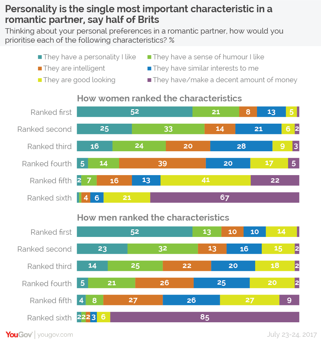
Original visualization

This week YouGov gave us a visualization to work with on the subject of British love interests.
What works well
- It is easy to see how personality ranks
- It isn't as easy, but you can also see how unimportant money is to Brits
What could be improved
- It would be nice to see how other characteristics compare to one another
What I did

I thought it would be nice to show a sort of heat map for the different percentages within each country. Thankfully, Elijah Meeks walks through how to do exactly that in chapter 7 of his D3 in Action book. After revising his code a bit I was able to create something that allows the user see how the love interest compare across all countries.
If you like what was, I'd love to hear from you. Say hi on Twitter @robcrock or shoot me an email at robert@vizsimply.com
Acknowledgments
This project would be what it is without the efforts of Andy Kriebel and Eva Murray. Thank you for all the work you do for this community.
Elijah, thank you for create great content in your books for others to build off.
Built With
- D3v4 - JavaScript visualization kernel
- Materialize CSS - Based on Google's design philosophy
- Materialize JS- Materialize dependancy
- jQuery - Materialize dependancy
License
This project is licensed under the MIT License - see the LICENSE.md file for details